library(shiny)
library(dplyr)
library(stringr)
library(ggplot2)
library(forcats)
library(nycOpenData)
library(knitr)
library(DT)9 NYC 311 Data Exploration
9.1 Introduction
The NYC 311 system includes a large collection of non-emergency service requests submitted by New Yorkers. Using the nycOpenData package, specifically the nyc_311 function, we pulled a random sample of 10,000 requests to explore how different types of complaints vary across boroughs and agencies. We begin by examining overall patterns through descriptive tables and visualizations, and then use a chi-square test to determine whether complaint types differ by borough. To enhance the analysis, an interactive Shiny application is included that allows users to filter the data by borough and agency, adjust how many top complaints to view, and examine the most common issues within each category.
9.2 Loading Libraries
First, we load the necessary libraries required to run the Shiny app and perform the analysis.
9.3 Loading The Dataset
Then, we load the dataset into R so it can be cleaned, explored, and used in the Shiny app.
data_311 <- nyc_311(limit = 10000)9.4 Data Cleaning
Since this analysis focuses on boroughs, agencies, and complaint types, we standardized the formatting of these columns to ensure consistency across the dataset.
data_311 <- data_311 %>%
  mutate(
    complaint_type = str_to_title(complaint_type),
    borough = str_to_title(borough)
  )
9.5 Descriptive Statistics
Next, we summarized the number of 311 complaints by borough and identified the three most frequent complaint types within each borough by grouping the data, counting occurrences, and ordering the results. We then visualized these patterns using a faceted bar chart to compare complaint trends across boroughs.
boro_comp <- data_311 %>% count(borough, sort=T)
boro_comp %>%
  knitr::kable()
top3 <- data_311 %>%
  group_by(borough, complaint_type) %>%
  summarise(n = n(), .groups = "drop") %>%
  arrange(borough, desc(n)) %>%
  group_by(borough) %>%
slice_head(n = 3)| borough | n |
|---|---|
| Brooklyn | 3155 |
| Queens | 2431 |
| Bronx | 2156 |
| Manhattan | 1905 |
| Staten Island | 346 |
| Unspecified | 7 |
top3 %>%
  ggplot(aes(x = reorder(complaint_type, n),
             y = n,
             fill = complaint_type)) +
  geom_col(fill = "cornflowerblue") +
 facet_wrap( ~ borough, scales = "free") +
  coord_flip() +
  labs( title = "Top 3 Complaint Types in Each Borough",
        x = "Complaint Type",
        y = "Count") +
  theme_minimal()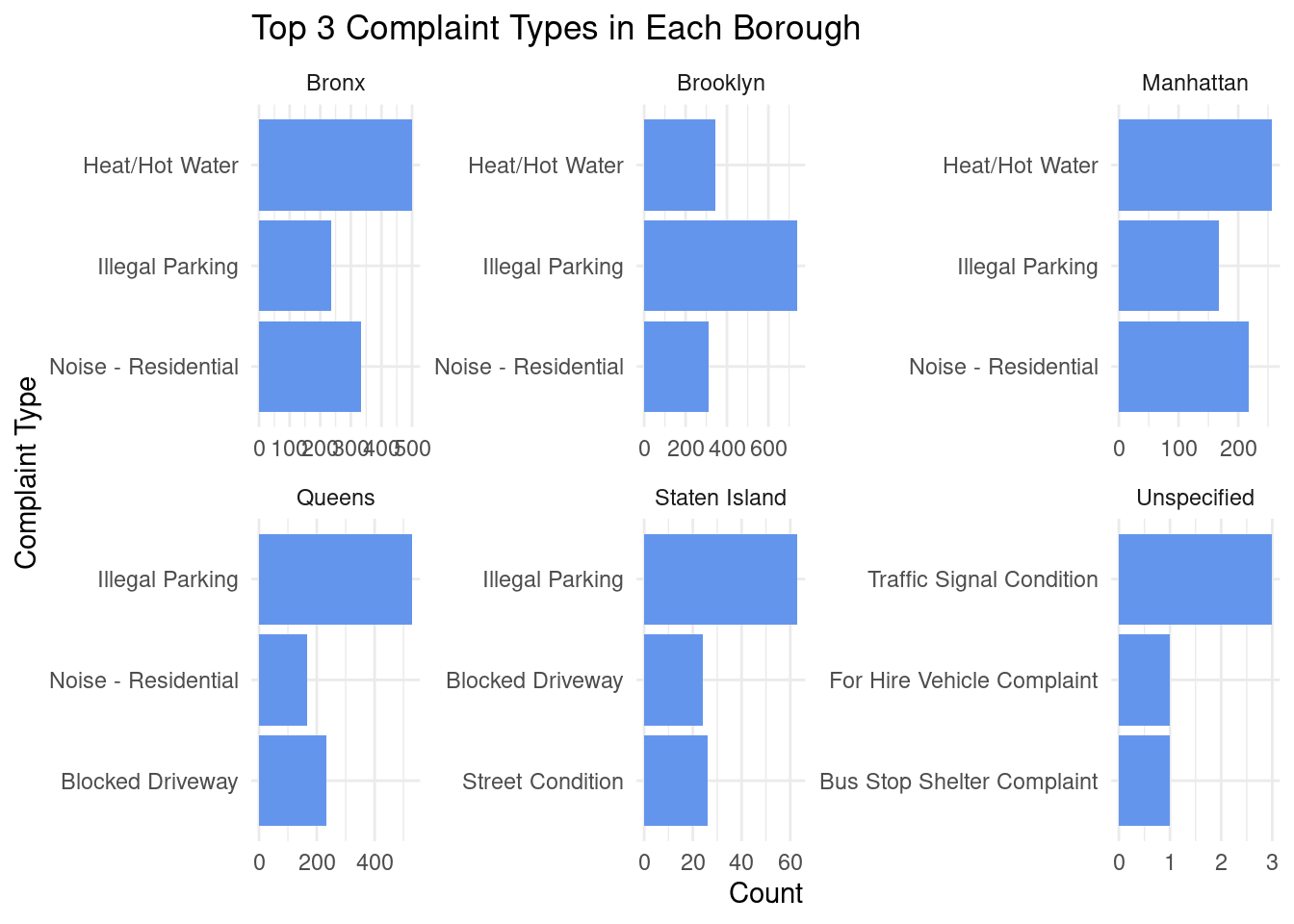
9.5.0.1 Interpretation:
Across NYC boroughs, Illegal Parking is among the most common complaints, particularly in Brooklyn, Queens, and Staten Island, while Heat/Hot Water complaints dominate in the Bronx and Manhattan. Noise – Residential complaints also appear frequently across boroughs but are not the leading issue everywhere. Overall, the figure shows both shared citywide concerns and borough-specific patterns.
9.6 Inferential Testing: Chi-Square
Additionally, we run a chi-square test to examine whether complaint types are distributed differently across boroughs.
tab <- table(data_311$complaint_type, data_311$borough)
chisq.test(tab)
    Pearson's Chi-squared test

data:  tab
X-squared = 3104, df = 595, p-value < 2.2e-16
9.6.0.1 Interpretation:
The chi-square test showed a significant association between complaint type and borough, χ²(595) = 3104, p < .001. This indicates that the distribution of complaint types differs across boroughs, meaning certain complaints occur more frequently in some boroughs than in others.
9.7 Interactive Exploration of NYC 311 Complaint Patterns
Here, we set up the inputs for my interactive 311 explorer. Users can choose a borough, select an agency, and adjust how many top complaint types they want to see. These inputs automatically update the plot below.
WarningInteractive Feature Notice
The controls above are part of an interactive tool designed to run in a live R/Shiny environment. In this static version of the report, the inputs are visible but the chart may not appear because it cannot update dynamically.
To view the full interactive visualization, the app must be run locally in RStudio or hosted on a Shiny server.
This interactive bar chart displays the most frequent complaint types for a selected agency. Users can filter by agency and adjust the number of top complaint types shown, with bar lengths representing the total number of complaints.